
Redesigning the UAE's first licensed digital wallet from amateur to authoritative.
Client
e&money, UAE
Duration
6 months | Dec 2022 – Mar 2023
Team
1 McKinsey Associate Partner
2 UX Designers | 2 UI Designers
Role
Principal UI Designer :
Interaction design, Competitive intelligence,
Visual system, Design ops
Numbers that matters
The Problem
The UAE's first licensed digital wallet was losing users before they made a single transaction.
e&money had a regulatory credential no competitor could claim: the first digital wallet licensed by the Central Bank of the UAE. It didn't matter. Users were leaving.
The UAE's remittance market is one of the most competitive in the world. Blue-collar workers sending monthly salaries home. Professionals managing cross-border transfers. A workforce where over 80% are expatriates with established financial habits and a short list of trusted apps. e&money's first version had entered this market with an interface that communicated the wrong things: uncertainty, immaturity, risk. Users who opened the app saw something that didn't look like it could be trusted with real money
The business problem wasn't that e&money lacked features. It was that no amount of new features would be used by people who didn't trust the product enough to fund their wallet in the first place.
Hard Contraints
• Competing against established regional and global fintech names with years of trust-building behind them
• UAE's highly diverse expat demographic blue-collar, white-collar, executive with distinct remittance needs and mental models
• 6-month delivery window for 12+ journeys and 120+ screen variations
• IMT was missing entirely from v1 and had to be designed from scratch the most technically complex journey in the app
My Role
I owned competitive intelligence, interaction design, and UI execution across the full product. Every feature and journey was benchmarked against 20+ regional and global fintech apps before ideation began. That benchmarking became the shared design language between the McKinsey-led engagement team and the client moving design decisions from opinion to evidence in stakeholder reviews.

The Reframe
The brief said: build a financial super app. The real problem: earn the right to be one.
"Users weren't asking whether e&money had the right features. They were asking whether e&money was the kind of app they could trust with their salary."
The original brief framed this as a capability problem add international money transfers, improve merchant payments, integrate gifting and bills, modernise the interface. The assumption underneath it: better features, better adoption.
Research and the existing app audit told a different story. The first version hadn't failed because it lacked features. It had failed because every visual and interaction signal communicated a product that wasn't ready. Low-fidelity aesthetics, inconsistent patterns, unclear transaction flows in financial products, these aren't just UX problems. They're trust signals. And in a market where users are choosing where to send their month's wages, trust is the product.
That reframe changed the design priority entirely. Onboarding and the homepage weren't feature surfaces they were credibility surfaces. The first 60 seconds of using e&money had to communicate safety and reliability before a user would consider initiating a transfer.
Every benchmarking session, every interaction decision, every visual call was filtered through a single question: does this make e&money feel like a product you'd trust with real money?
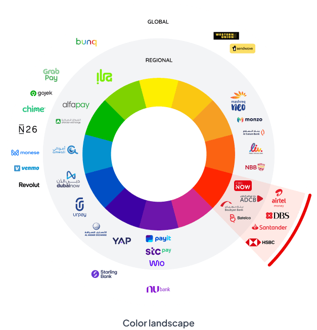
We benchmarked across a list of 20+ regional and
global fintech apps
Other FinTech apps
• Most fin tech apps use a white background to allow the content and interactions to take forefront
• Addition of complementing pastel / contrasting colours to the digital palette to create superior app experiences
• Craft a unique personality through tone and illustrations, using reusable patterns for consistency.
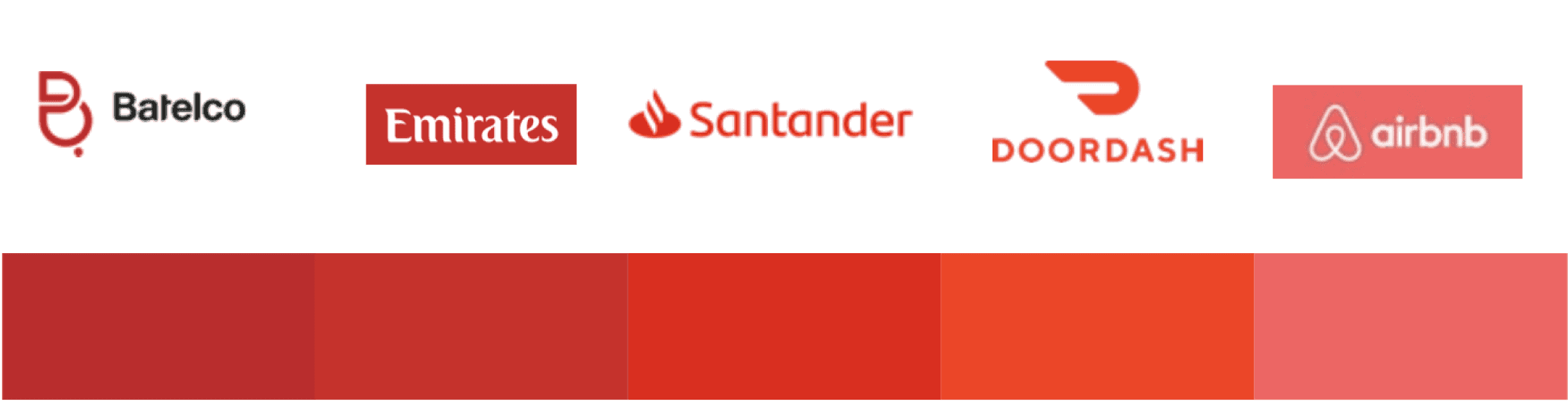
Brands/ Fintech apps using red
• Even though the marketing and brand kit is predominantly red, the same is not true for their App interfaces.
• Usage of red is restricted to primary actions and iconography
• White backgrounds help in improve the legibility
• Addition of complementing colours helps in creating a visual break
Why This Was Hard
Fintech redesigns fail when they optimise for features instead of confidence.
The original brief framed this as a capability problem add international money transfers, improve merchant payments, integrate gifting and bills, modernise the interface. The assumption underneath it: better features, better adoption.
Research and the existing app audit told a different story. The first version hadn't failed because it lacked features. It had failed because every visual and interaction signal communicated a product that wasn't ready. Low-fidelity aesthetics, inconsistent patterns, unclear transaction flows in financial products, these aren't just UX problems. They're trust signals. And in a market where users are choosing where to send their month's wages, trust is the product.
First Challenge
Stakeholder caution after v1 failure
What it required : Evidence-backed advocacy across multiple review cycles benchmarking, not opinion
Second Challenge
Rapid delivery: 12+ journeys in 6 months
What it required : Structured benchmarking framework run ahead of each journey to make decisions fast and defensible
Third Challenge
IMT: regulatory complexity, multi-corridor edge cases
What it required : User-facing simplicity reduce to three decisions while absorbing backend complexity into the flow
Forth Challenge
Diverse UAE demographics with different needs
What it required : Personalised, adaptable IA widget system that responded to nationality, usage, and account depth
Fifth Challenge
Competing against established trusted brands
What it required : Lead with credibility signals, not feature inventory restraint as a strategic position
The UAE's financial app market had set a high visual and functional benchmark. Users compared e&money not just to regional wallets but to Wise, Revolut, PayPal apps with years of trust-building behind them. Competing on feature count was a losing position. Competing on experience quality was the only viable play.
Process & Decisions
Every feature was benchmarked before it was designed. Every decision was reasoned before it was presented.
The project ran under significant time pressure with a senior McKinsey partner as lead which meant design decisions needed to be fast, evidence-backed, and defensible in stakeholder reviews without long deliberation cycles. I established a structured benchmarking process that ran ahead of each journey: 20+ regional and global fintech apps assessed for how they handled the same feature, what patterns drove trust, and what the visual standards were in the market. That competitive intelligence became the mechanism that moved design conversations from preference to evidence.
Decision 1 : Homepage as a trust surface, not a feature index
The homepage was the highest-friction conversation of the engagement. Stakeholders, burned by v1, wanted something conservative familiar patterns, nothing that could be called a risk. The instinct was to pack the homepage with features to demonstrate capability.
I pushed for the opposite, with benchmarking to support it. Analysis of the strongest fintech apps in the market showed a consistent pattern: the most trusted interfaces led with clarity and restraint. Balance visibility, three immediate actions, then depth. Feature density read as overwhelming, not reassuring. I ran multiple review cycles with competitor evidence to shift the conversation from 'is this too minimal?' to 'this is what trusted apps do.'
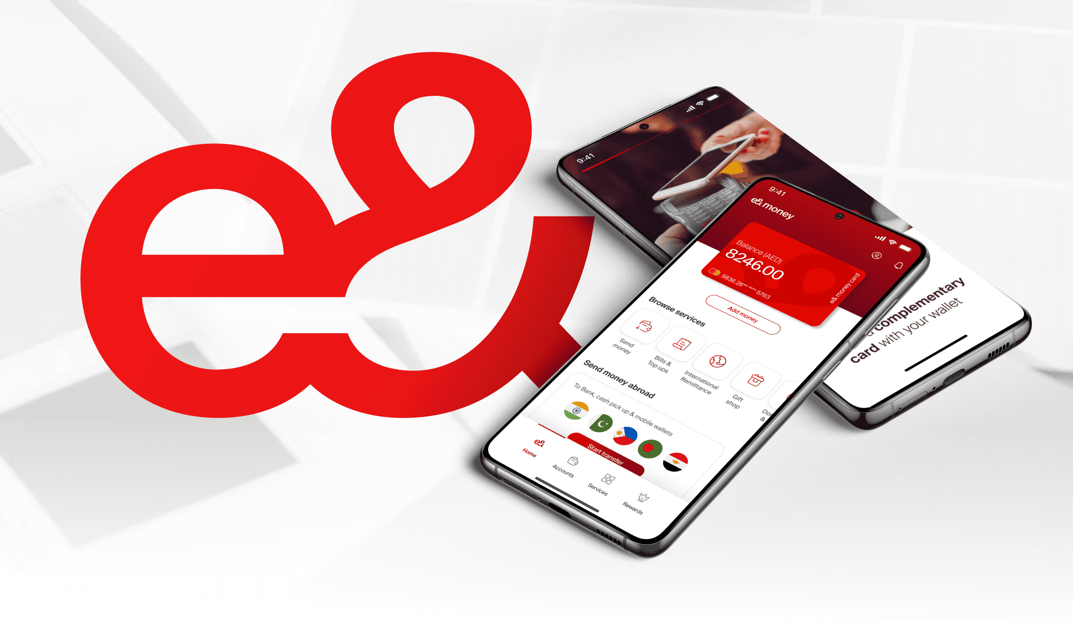
The final homepage: personalised, dynamic, four core journeys from bottom navigation, a widget system that adapted to user behaviour and nationality. Credibility first. Capability second.

"Led with balance visibility and three immediate actions not a feature showcase. Credibility before capability."
Decision 2 : IMT as a transparency flow, not a transaction flow
IMT was the most complex journey in the app and the one missing entirely from v1. For the UAE's large expat workforce, monthly remittances are a primary financial activity getting this wrong wouldn't just create UX friction, it would destroy trust at the moment users needed most confidence.
The technical complexity was significant: real-time exchange rates across multiple country corridors, rate-freeze functionality allowing users to lock in a rate for a subsequent transfer, KYC requirements varying by corridor, and edge cases multiplying across payment methods and recipient types.
The design decision: frame the entire flow around transparency, not speed. Show the exchange rate prominently before the user commits. Explain the fee. Surface the rate-freeze as a visible, named control. Benchmarked against Wise, Remitly, and regional competitors on one criterion: does this make the user feel informed, or processed? Informed users trust. Processed users abandon.
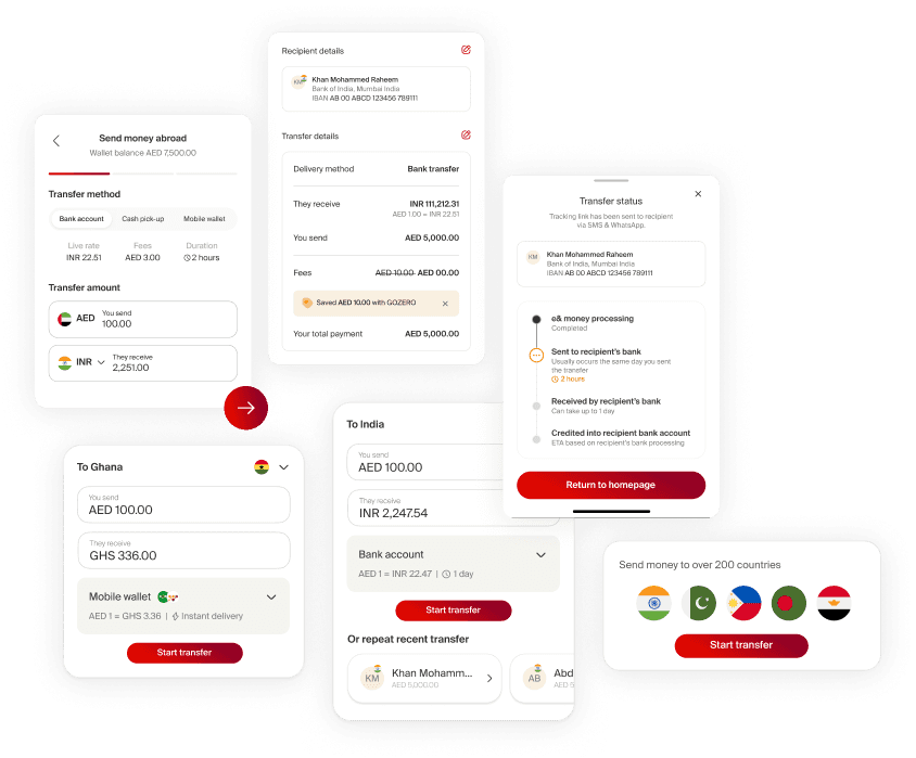
"Rate and fee visible at the decision point, before recipient details. Users sending their salary need to understand what they're sending before they confirm."
Decision 3 : Onboarding as the first trust signal
In a market where competing apps were established and known, e&money's onboarding had to do more than register a user it had to make them want to complete registration. Benchmarking showed the fastest regional fintech apps completed registration under 2 minutes using national ID or UAE Pass, a flow v1 didn't offer.
I defined the onboarding redesign around three principles: fastest path to wallet activation for existing Etisalat users, EID and UAE Pass integration for speed, and multilingual support across the UAE's primary expat demographics with contextual guidance at each step.
The personalisation moment custom card selection at the end of registration was a deliberate trust signal. It communicated that e&money saw the user as an individual before asking them to fund a wallet. Small detail. High impact on first impressions.

"EID and UAE Pass registration under 2 minutes. Card personalisation at the close shifted the emotional tone from compliance to welcome."
The Solution
A financial super app redesigned from the trust layer up.
Homepage : Persoanlised & Dynamic
Four core journeys from bottom navigation. Widget system adapting to user nationality, usage patterns, and account depth. Viewport designed to scale as users deepened their relationship with the product accommodating more instruments over time without a redesign.
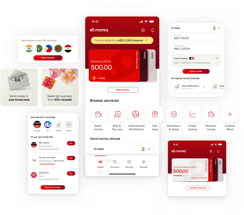
"Balance visibility and three immediate actions. Widget system adapts to usage power users get shortcuts, new users get guidance."
International Money Transfer : Transparent and Fast
Multi-corridor remittance with real-time exchange rate visibility, rate-freeze functionality, and single-click repeat transfer for returning users. Regulatory complexity absorbed into the backend. User experience reduced to three decisions: who, how much, confirm.
"Rate-freeze surfaced as a named feature, not a setting. For weekly senders, this is the habit-building mechanism."
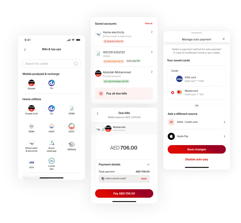
Bill Payments : Unified and Automated
Categorised billers with quick search, saved accounts, due-date visibility, multi-select for batch payments, and auto-payment setup. Returning users see their saved billers and due bills on entry zero navigation for most common tasks.
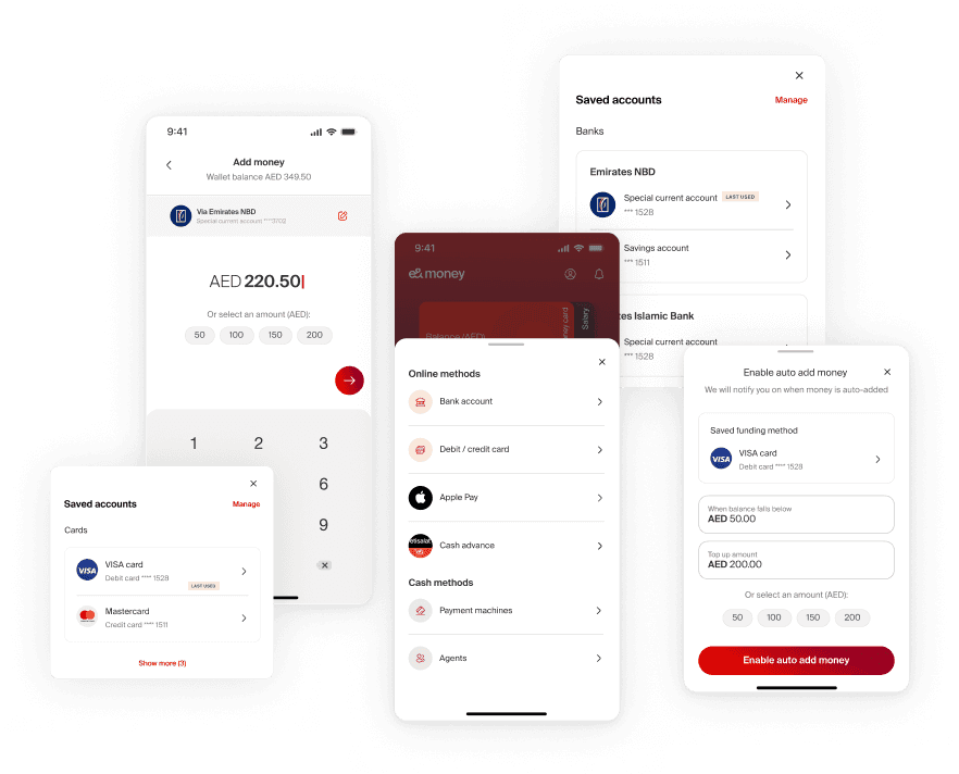
Add Money : Contextual & Predictive
Quick-action tray with last-used method prioritised. Apple Pay and Cash Advance as new options. Auto-add to wallet for recurring users. The flow adapted to behaviour shortcuts for power users, guidance for new ones.
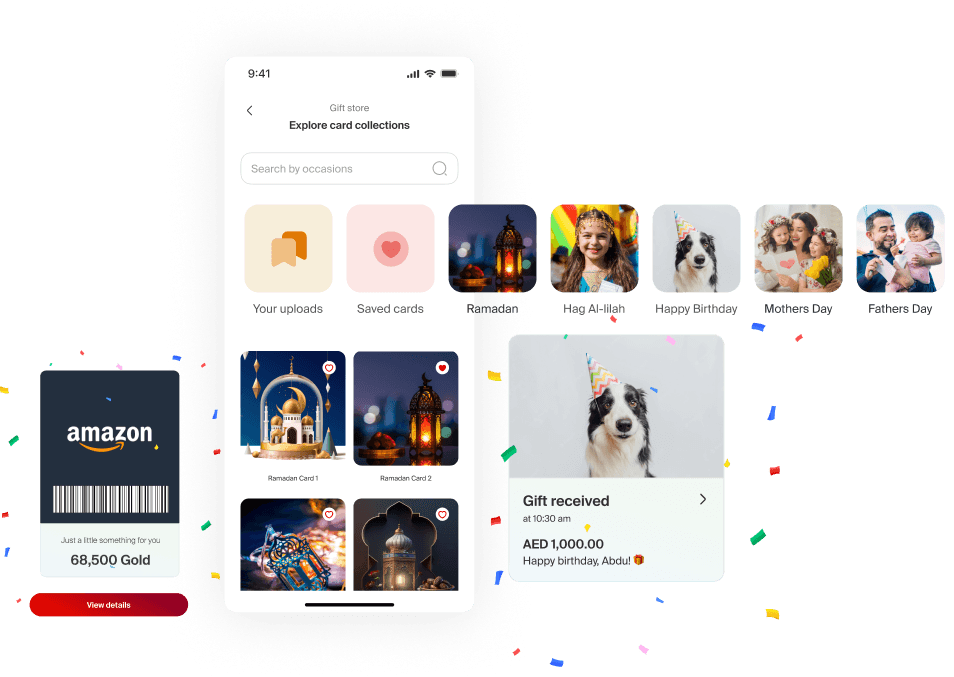
Gifting : Occasion-aware & Personal
Occasion-based card designs plus user-uploaded options. Scheduled gifting, personalised messages, and KYC redirection handled without breaking the flow for senders whose recipients weren't yet registered.
Design System : Atomic & Scalable
Built on Atomic Design principles: colour palette, typography, component library, illustration framework, and character design system. Red constrained to primary actions and key UI elements not backgrounds or decoration. Pastel palette for feature differentiation. White space as the primary credibility signal.
20+ competitor apps showed the same pattern: brands that diluted their primary colour across backgrounds lost visual hierarchy and perceived quality. The constraint wasn't a stylistic choice it was a trust decision.
The library was built to accommodate features that didn't exist yet. Scalability was a first-class requirement from the start, not added at the end.
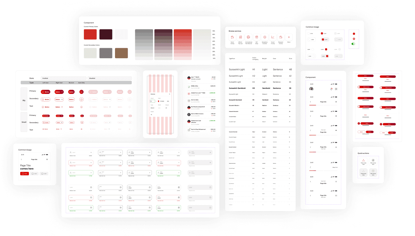

"Red constrained to primary actions only. The system was built to scale beyond this engagement new features inherit the principles, not just the components."
Impact
Play Store rating: 3.9 → 4.8 post-redesign
Best Wallet — MENA Fintech Association, Abu Dhabi Finance Week 2022
128,000+ total app downloads
Prototype validated with 50+ users across blue-collar, white-collar, and executive demographics
Nationalities covered: UAE's primary remittance corridors
The rating lift didn't come from new features. It came from an interface that finally communicated trustworthiness before it asked for anything. Users across blue-collar, white-collar, and executive demographics completed core journeys transfer, bill payment, top-up without task failure in final usability sessions.

"By prioritising redesigned journeys, personalised features, and increased transparency, our aim is to elevate the daily experiences of our customers." - Khalifa Al Shamsi, CEO, e& life
Reflection
What the project taught me about trust in fintech
A financial app's visual quality is a proxy for its reliability in the user's mind. Users who can't evaluate whether an app is technically secure evaluate whether it looks secure instead. Every visual decision in this project was downstream of that reality.
What was harder than expected
The homepage advocacy, not the homepage design. Stakeholders who had watched v1 fail were risk-averse in ways that would have produced another cautious, forgettable interface. Getting to a genuinely modern design required sustained, evidence-backed pushback across multiple review cycles. The benchmarking framework was the tool that made that possible it shifted the conversation from preference to evidence.
What I'd do differently
Run dedicated research with the blue-collar remittance segment before wireframing, not during it. Their distinct needs around exchange rate literacy and multilingual support weren't fully visible until late in the process. Earlier exposure would have sharpened the IMT flow and multilingual onboarding from the start, not under delivery pressure.
What I'd tell the next designer on this product
Document the decisions behind the design system, not just the system itself. The reasoning behind constraints why red is limited to primary actions, why the pastel palette maps to specific feature categories lived in the team's heads. When the next team inherits the components, they'll have the system but not the principles.